Another mockup for a fake game – really trying to strike a balance between clean and informative. Since most of my focus around UI/UX is in mobile/f2p, I wanted this design to represent that without being too egregious. Everything except the ability icons, fonts, and the character image (an edited Mixamo character) is of my own design/creation. This was done in 3 main stages with some polish in between.

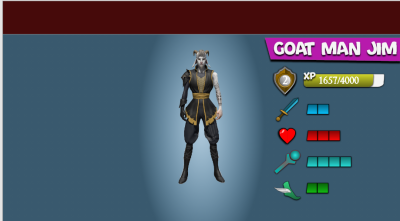
I often start these by looking around at the Game UI Database website for inspiration. I really liked the look of the Brawl Stars character select. When I do these mockups I often don’t have a full plan in place so the first thing I like to do is get the most essential bits on the screen first. I use a mix of Adobe XD and Illustrator to create most of my shapes/icons. I was originally going to to go with a top nav bar but later decided against it. I like the concept of this being one in a series of 1->2->3 style screens (title, play, select).
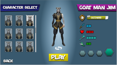
This is the second character select I have done in this style so I plan to mix it up for the next piece – you might notice that all of the characters are the same, this is one of the areas I think you can get away with something like this if you don’t have actual character portraits or the ability to create new ones. At this point I have pretty much everything in place except the ability icons.


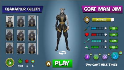
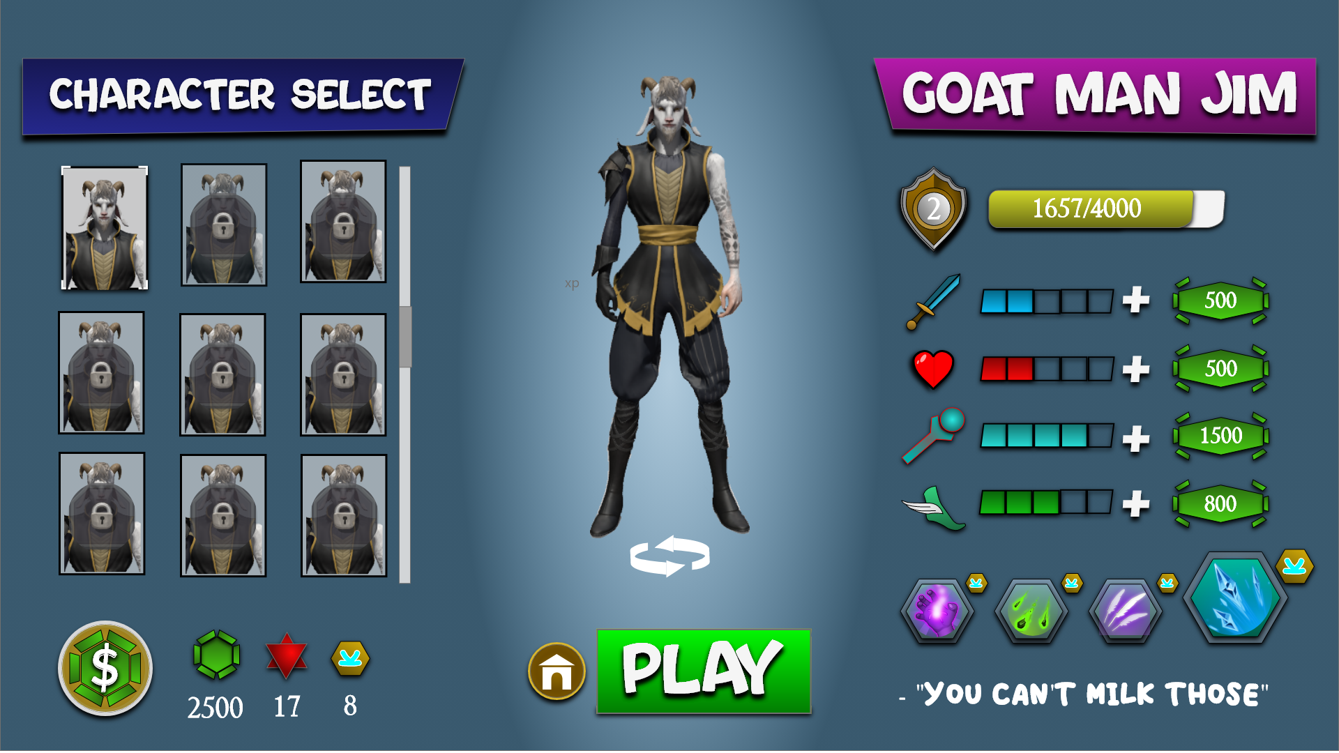
And there you have it, the finished piece. I added empty boxes next to the stat icons because without that a player has no real idea how to compare them. After that was done, I went through and added a layer of F2P “Goodness” – 3 currencies, a shop icon, and clear indications of how you can use/spend your spoils. I like to make sure my designs are coherent, so locking off the other characters and framing this as a single player game made more sense after adding in the ability to spend resources on upgrading your character (as opposed to a static hero like in LoL or Apex).
