Some mockup screens created using Adobe XD, Unity, and a variety of random game art assets. The idea was to take assets I had on hand and use them to create something that at a glance could pass for a real F2P mobile game. This is a combination of UI/UX since the elements on each screen are designed with the user in mind. Some of the terms below (IE Torture Break) come from the Octalysis Framework, which is a system you can use to help plan gamification in your own projects. I will probably write a post about it at some point.

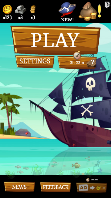
Main Menu
I had a lot of fun designing the menu. I wanted to create something clean and stylized while also integrating common UX/Mobile gaming aspects.
I went with icons to indicate multiple currency/resource types (Gold, Bars, and.. Voodoo Heads? Ya, lets go with that) in the top left to show a players current amounts for each. This is re-enforced in other areas of this project with the placement meant to implicitly suggest value/scarcity with gold coins (the soft currency) being the most common and Voodoo Heads being the rarest currency type.
The hat with the NEW! text are meant to indicate some sort of daily reward/cosmetic tab, and the bag of coins is a shop that is *oh so urgently* letting the player know something there is important.
Beyond the remaining controls (Play, Settings, News, and Feedback) there are two desired actions for the player to take. Both are set behind Countdown Timers (a technique used to increase anticipation of a reward) with the top action using the allure of a random reward and the “watch an ad for coins” action incorporating a mild Torture Break (a forced pause that encourages players to come back when the timers are up) to help with retention and player anticipation. Necessary? Probably not.
In the end I think I achieved my goal clean title screen with clear feedback and multiple hooks to drive user actions with a flew slightly cynical F2P elements thrown in for good measure.
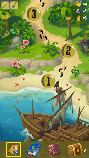
Game Map/Level Select Screen
This screen was actually created before the title screen (why you ask? “good question” I respond). The idea is that in the story (that doesn’t exist) for this game (being that there is no gameplay mockup in this set this could be anything so just roll with it) you crash your ship and must adventure through the jungle completing levels in order to advance. This mockup shows what it would look like if the player had unlocked and completed the first 3 levels.
From a gamification standpoint we have a few things going on. The chest with the key is supposed to stand in for how many keys you have collected (found or won) that you can open your chests with. What do chests contain? Who knows!
I felt the footsteps really added to the feel of the game while also being an element that you can use to guide the users vision to the next level.
Really the only other non standard stuff on this screen are the little hidden interactable elements. For example there are two “hidden” X marks the spot location to dig for treasure at, a banana bunch you can tap for a fun animation, etc. I like the idea of the game map being as interactive as possible and it is a great way to put a bunch of polish and extra content in your game, especially for the Explorer and Achiever player types (Link) – little moments of discovery and delight do a lot to drive retention since the player will always be looking for hidden secrets.
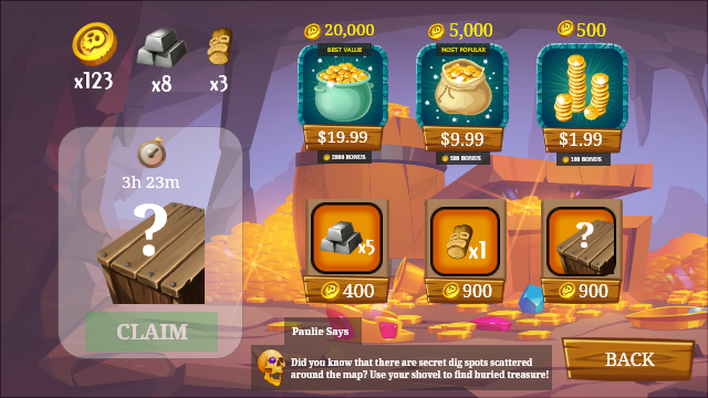
Game Shop Screen
Yes. I know. This is landscape and the other two are portrait. Sue me.
Anyways, this is my attempt at a mobile shop for a game like this (whatever this is) that incorporates standard F2P shop tropes while imparting my own style.
First we have a pretty standard set of hard currency items. The positioning is intentional with the desired action being the middle pack. By placing the $20 option in the place the user is most likely to look first, they are now anchored so you can make an otherwise less appealing offer more attractive. Each also comes with the standard “bonus currency” offer. I am aware the amounts don’t really math out but that isn’t the point…
Once you have bought (or earned) gold you can convert it to resources used in the shop for certain items. Again, this being a UI/UX piece I didn’t put as much thought as I probably should have into the numbers but luckily numbers are easy things to tweak.
Also featured is a chest that unlocks after a timer (the chest from the main screen when you can open it actually would take you to the store because you know.. exposure.) and a little in game character “Paulie” (#ithinkimfunny) that gives players hints and tips. These would (in theory) cycle at random and some would only unlock after certain in game milestones to give a sense of “I wonder what Paulie will say next”. There are some other minor things, like anchoring the value of a VooDoo Head to a random chest so players will feel like they have a good chance of pulling something decent out of the random draw.
In the end, nothing really groundbreaking in terms of UX but I feel this would certainly pass as a real game if someone saw one of these screens on your phone. It’s a tad cynical, but so am I.